基础知识
组件
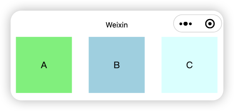
view
类似HTML里面的div
是一个块级元素
使用演示:
<view class="container1"> <view>A</view> <view>B</view> <view>C</view></view>x.container1 view { width: 100px; height: 100px; text-align: center; line-height: 100px;}
.container1 view:nth-child(1){ background-color: lightgreen;}.container1 view:nth-child(2){ background-color: lightblue;}.container1 view:nth-child(3){ background-color: lightcyan;}
.container1 { display: flex; justify-content: space-around;}实现效果:
最佳实践
就把这个组件当做HTML里面的div标签使用就可以了
scroll-view
实现可以滚动的视图效果
使用演示:
xxxxxxxxxx<scroll-view class="container1" scroll-y> <view>A</view> <view>B</view> <view>C</view></scroll-view>xxxxxxxxxx.container1 view { width: 100px; height: 100px; text-align: center; line-height: 100px;}
.container1 view:nth-child(1){ background-color: lightgreen;}.container1 view:nth-child(2){ background-color: lightblue;}.container1 view:nth-child(3){ background-color: lightcyan;}
.container1 { border: 1px solid red; width: 100px; height: 120px;}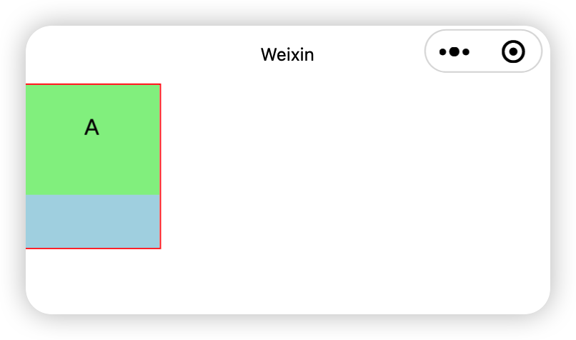
注意需要scroll-y的意思是支持纵向滚动
同理也有scroll-x
设置了scroll-y之后需要给容器设置一个高来设置显示的区域大小
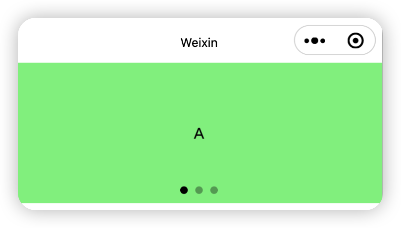
swiper和swiper-item
轮播图的容器组件
轮播图的item组件
使用演示:
xxxxxxxxxx<swiper class="swiper-container" indicator-dots> <swiper-item> <view class="item">A</view> </swiper-item> <swiper-item> <view class="item">B</view> </swiper-item> <swiper-item> <view class="item">C</view> </swiper-item></swiper>xxxxxxxxxx.swiper-container { height: 150px;}
.item { height: 100%; line-height: 150px; text-align: center;}
.swiper-item:nth-child(1) .item { background-color: lightgreen;}
.swiper-item:nth-child(2) .item { background-color: lightskyblue;}.swiper-item:nth-child(3) .item { background-color: lightcoral;}效果:
swiper容器属性讲解
indicator-dots
是否显示面板指示点
xxxxxxxxxx<swiper class="swiper-container" indicator-dots>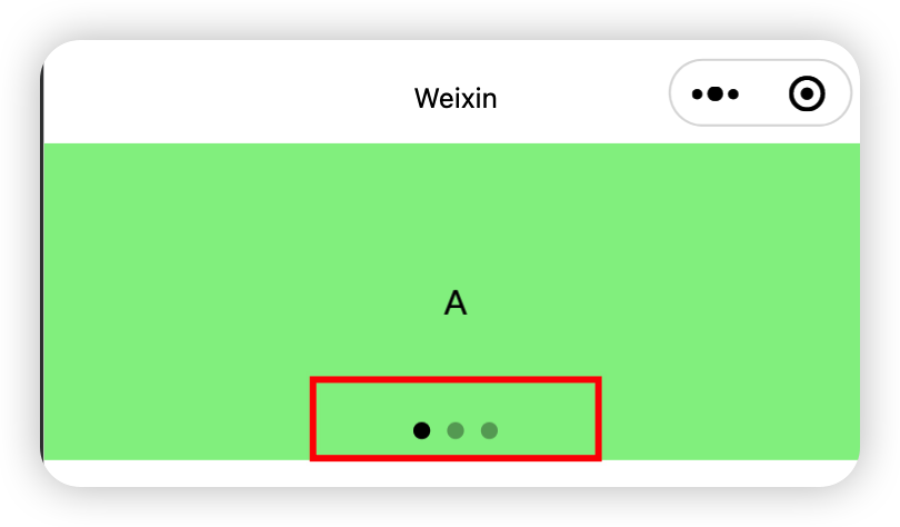
indicator-color
设置未激活的面板指示点的颜色
xxxxxxxxxx<swiper class="swiper-container" indicator-dots indicator-color="red">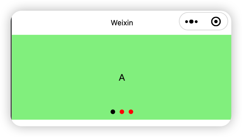
indicator-active-color
设置激活的面板指示点的颜色
xxxxxxxxxx<swiper class="swiper-container" indicator-dots indicator-active-color="red">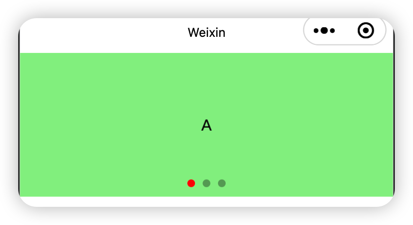
autoplay
设置是否自动切换
xxxxxxxxxx<swiper class="swiper-container" indicator-dots indicator-active-color="red" autoplay>这样设置以后每五秒会自动切换轮播图
interval
设置轮播图自动切换的时间(单位为毫秒)
xxxxxxxxxx<swiper class="swiper-container" indicator-dots indicator-active-color="red" autoplay interval="1000">circular
设置轮播图可不可以衔接
xxxxxxxxxx<swiper class="swiper-container" indicator-dots indicator-active-color="red" circular>默认轮播图是不可以衔接的,比如现在有三张,切换到第三张再继续的话默认是划不动的,加上了circular属性之后,切换到第三张以后再继续滑就可以到第一张
text
文本组件
类似于HTML里面的span组件,是一个行内元素
使用演示:
xxxxxxxxxx<view> 手机号长按选中效果: <text selectable>12222222222</text></view>添加selectable属性可以实现用户长按实现复制的效果
在小程序中只有通过text组件添加selectable属性才可以实现长按选中效果
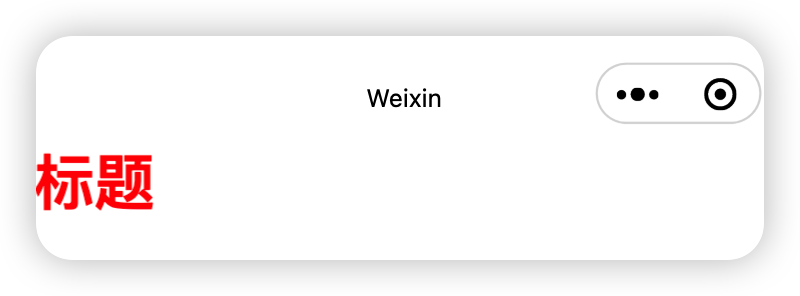
rich-text
通过rich-text组件的nodes属性可以实现把HTML字符串渲染为对应的UI结构
使用演示:
xxxxxxxxxx<rich-text nodes="<h1 style='color:red;'>标题</h1>"></rich-text>效果:
button
比HTML里面的功能要丰富
可以通过open-type属性调用微信提供的相关功能
使用演示:
xxxxxxxxxx<button>普通按钮</button><button type="primary">主色调按钮</button><button type="warn">警告按钮</button>
<button plain>镂空按钮</button><button size="mini">小尺寸按钮</button>
效果:
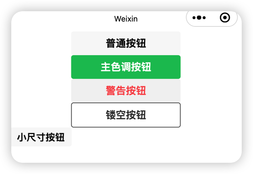
这些属性可以混合搭配使用
image
图片组件
默认宽300px高240px
使用演示:
xxxxxxxxxx<image></image><image src="/images/bg1.png"></image>xxxxxxxxxximage { border: 1px solid red;}效果:
默认情况下image标签会有300x240的长短比
此时可以增加mode属性设置图片的裁剪和缩放样式
image的mode属性参数讲解
aspectFit
保持长宽比,使长边能完全显示出来(图片能够完全显示出来)长边撑满

aspectFill
保持长宽比,使短边能够完全显示出来短边撑满

widthFix
保持长宽比,宽度不变,高度自动变化
heightFix
保持长宽比, 高度不变, 宽度自动变化
两类的区别(aspect和Fix)是
第一类的容器大小不变,让图片改变
第二类的容器大小变化,容器去适应图片
最佳实践:
使用widthFix
API
概述
1、事件监听API
特点:以on开头,用来监听某些事件的触发
举例:wx.onWindowResize(function callback)监听窗口尺寸变化的事件
2、同步API
特点1:以Sync结尾的API都是同步API
特点2:同步API的执行结果, 可以通过函数返回值直接获取,如果执行出错会抛出异常
举例:wx.setStorageSync('key', 'value')向本地存储中写入内容
3、异步API
特点:类似于jQuery中的$.ajax(options)函数,需要通过success、fail、complete接受调用的结果
举例:wx.request()发起网络数据请求,通过success回调函数接收数据
数据绑定
与vue中类似,使用双花括号进行数据的绑定
在vue中属性的动态绑定需要用到v-bind语法,在微信小程序中不需要
使用演示:
xxxxxxxxxx<view>{{ age }}</view><image src="{{ imgSrc }}" mode="widthFix"></image><view>{{ randomNum>5? '随机数大于5': '随机数不大于5' }}</view><view>{{ twoFixNum * 100 }}</view>xxxxxxxxxxPage({
/** * 页面的初始数据 */ data: { age:20, imgSrc: 'https://ts2.tc.mm.bing.net/th/id/OIP-C.i-zc-bfSYOZgIyqjDBydfAHaHa?rs=1&pid=ImgDetMain&o=7&rm=3', randomNum: Math.random() * 10, twoFixNum: Math.random().toFixed(2) })}效果:
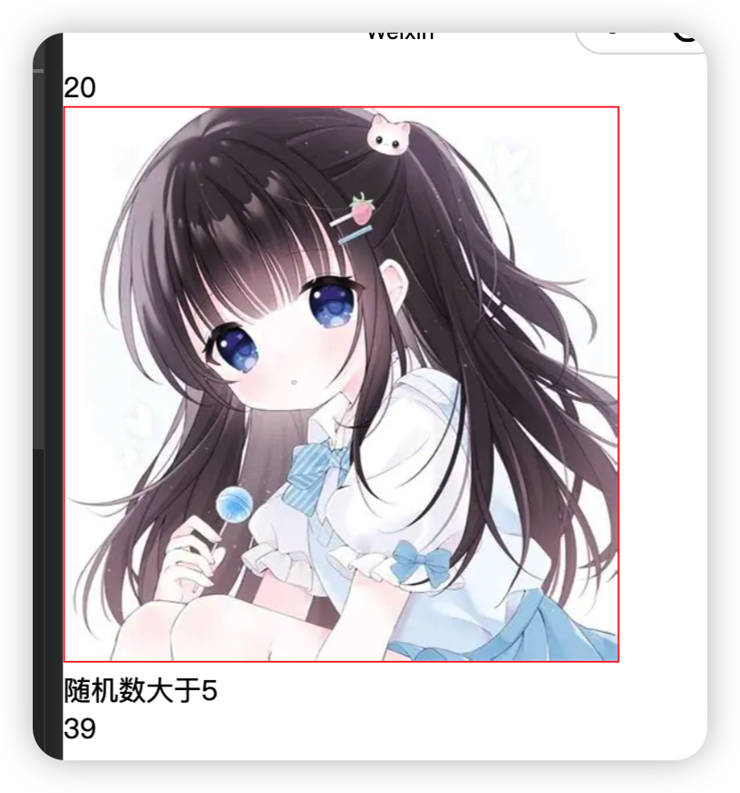
可以通过调试器里面的AppData项来查看自己定义的具体数据的值
事件绑定
tap
绑定方式有:
bindtap
bind:tap
事件描述:
手指触摸后马上离开,类似于HTML里面的click事件
input
绑定方式有:
bindinput
bind:input
事件描述:
文本框的输入事件
change
绑定方式有:
bindchange
bind:change
事件描述:
状态改变时触发
bindtap使用演示
xxxxxxxxxx<button type="primary" bindtap="btnTapHandler">按钮</button>xxxxxxxxxxdata: { },/* 为按钮绑定触摸事件 */btnTapHandler (e) { console.log(e)}注意此时的事件处理函数要与data同级编写
在事件处理函数中为data里面的数据赋新值
xxxxxxxxxx<button type="primary" bindtap="btnTapHandler">+1</button><view>{{ count }}</view>xxxxxxxxxxdata: { count: 0},btnTapHandler () { this.setData({ count: this.data.count + 1 })}利用setData修改数据的值
里面传递的是一个字典
字典里面的键是要修改的数据名,值是要修改成什么值
事件传参
bindtap
xxxxxxxxxx<button type="primary" bindtap="sendValue" data-info="{{2}}">传递一个值</button>接受这个参数时使用
e.target.dataset.参数名
例如此时就可以使用:
xxxxxxxxxxsendValue (e) {console.log(e.target.dataset.info)}打印传递过来的参数
注意此时利用花括号的好处是如果不加花括号他就是字符串类型的数据
在传递字符串类型的数据时就不需要加花括号
bindinput
xxxxxxxxxx<input bindinput="inputHandler"></input>接受这个参数时使用
e.detail.value
例如此时就可以使用:
xxxxxxxxxxinputHandler(e){console.log(e.detail.value)}打印文本框改变过后的最新的值
条件渲染
wx:if
可以搭配
wx:elif
wx:else
使用
使用演示:
xxxxxxxxxx<view wx:if="{{ type === 1 }}">男</view><view wx:elif="{{ type === 2 }}">女</view><view wx:else>保密</view>结合block使用wx:if
当我们需要同时控制多个标签的显示与隐藏,但又不想给页面增加多余的渲染元素时使用
block标签只是一个包裹性质的容器,他不会在页面中做任何的渲染
使用演示:
xxxxxxxxxx<block wx:if="{{true}}"> <view>标签1</view> <view>标签2</view></block>效果:
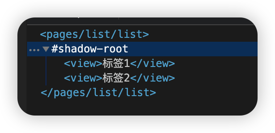
不会渲染出来
hidden控制元素显示和隐藏
hidden也可以控制元素的显示和隐藏,但是他始终会渲染出来
使用演示:
xxxxxxxxxx<view hidden="{{true}}">true的时候隐藏,false的时候不隐藏</view>效果:
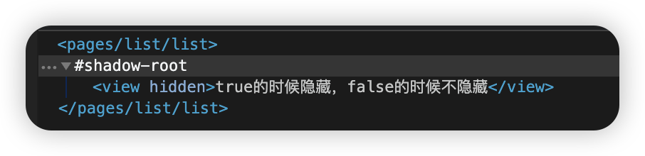
仍然被渲染出来了,注意隐藏的时候也不会占位置
列表渲染
wx:for
用于循环渲染,类似vue里面的v-for
使用演示:
xxxxxxxxxx<view wx:for="{{ arr }}"> 索引是: {{ index }} 值是:{{ item }}</view>xxxxxxxxxxdata: { arr: ['苹果', '小米', '华为']}效果:
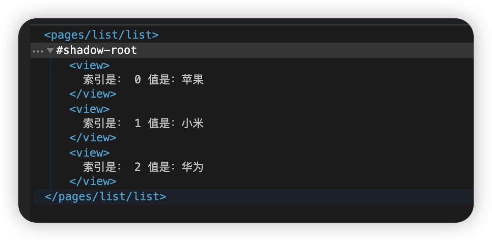
默认的名字是index和item
可以通过两个配置项来改名字
wx:for-index
wx:for-item
使用演示:
xxxxxxxxxx<view wx:for="{{ arr }}" wx:for-index="idx" wx:for-item="itm">索引是: {{ idx }} 值是:{{ itm }}</view>
wx:key
类似于vue,微信里面在循环渲染的时候也建议加上wx:key来提高渲染性能
使用演示:
xxxxxxxxxx<view wx:for="{{ arr }}" wx:key=”id“>{{ item.name }}</view>注意添加wx:key的时候不需要添加双花括号,添加了的话会出错
wxss
rpx
为了实现不同屏幕的大小适配
rpx把屏幕总宽度平均分为750份
即屏幕的总宽度为750rpx
例如:如果你的设备宽度是1500px,那么在你的设备上1rpx=2px
样式导入
通过@import "路径";可以导入外联样式表
xxxxxxxxxx@import "/common/common.wxss";全局样式和局部样式
在app.wxss里面定义的样式会在每一个页面中生效
权重相同时:当全局样式和局部样式冲突时,根据就近原则,局部样式会覆盖全局样式
权重不同时,谁高谁生效
怎么看权重:
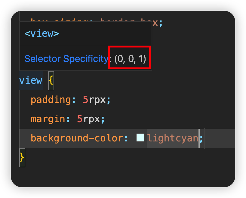
如图,此时权重是(0,0,1)如果有一个是(0,1,1)那后者权重就会高一点
全局配置(app.json)
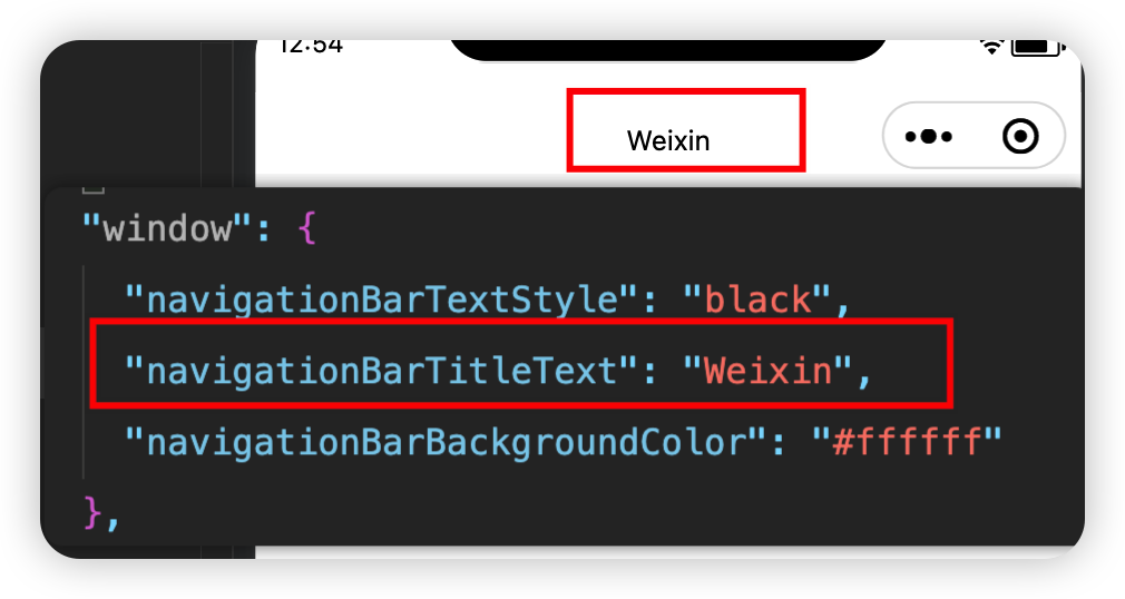
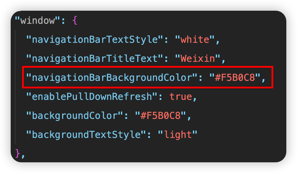
window节点
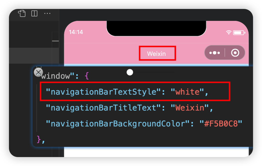
navigationBarTitleText
设置导航栏的标题
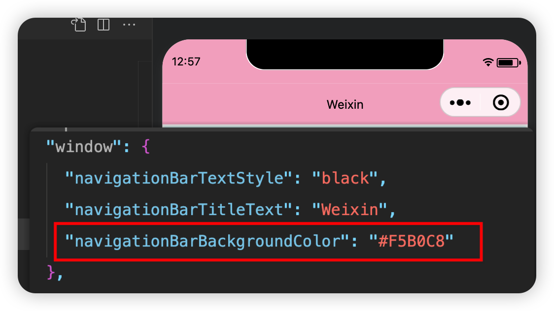
navigationBarBackgroundColor
设置导航栏的背景颜色
注意修改color的时候必须使用16进制颜色值,eg:#F5B0C8
navigationBarTextStyle
设置导航栏的标题颜色
注意这个参数的可选值只有white和black
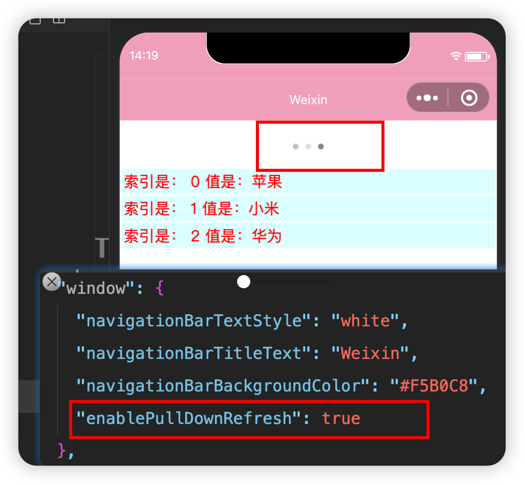
enablePullDownRefresh
设置全局下拉刷新功能(默认false)
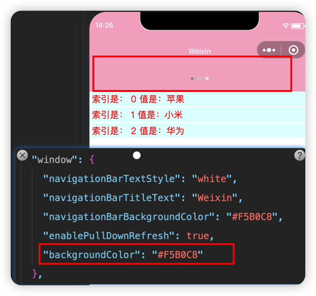
backgroundColor
设置下拉刷新时的背景颜色
只能是16进制的颜色值
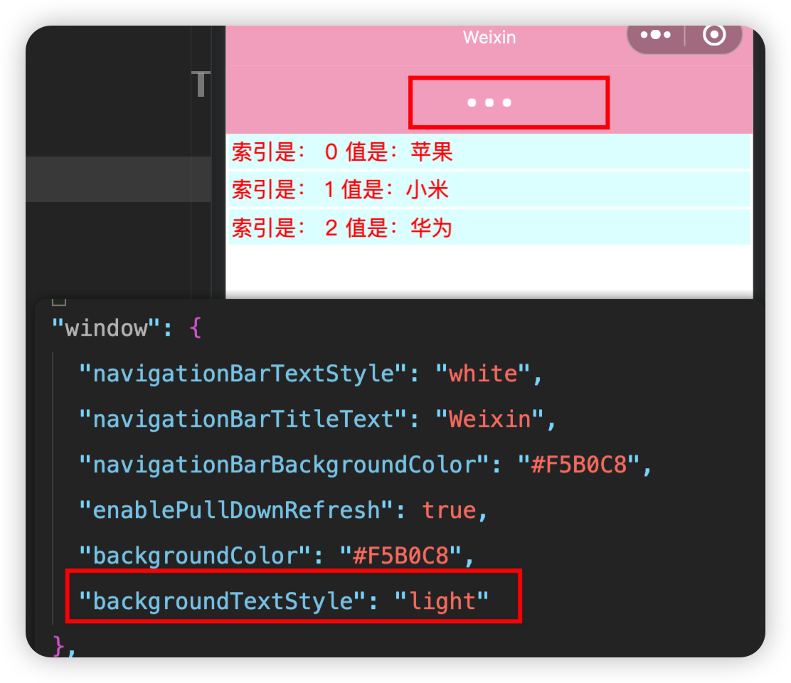
backgroundTextStyle
设置下拉刷新时的loading样式
注意这个参数值只有dark和light,默认是dark
onReachBottomDistance
设置上拉触底的距离
默认触底距离为50px,如果没有特殊需求,保持默认即可
参数值直接写数字即可,不需要带单位
xxxxxxxxxx"onReachBottomDistance": 100tabBar
tabBar是用于小程序中来快速切换页签的
分为底部和顶部
在顶部时只显示文本不显示图标
页签数量要求为2~5个
图解
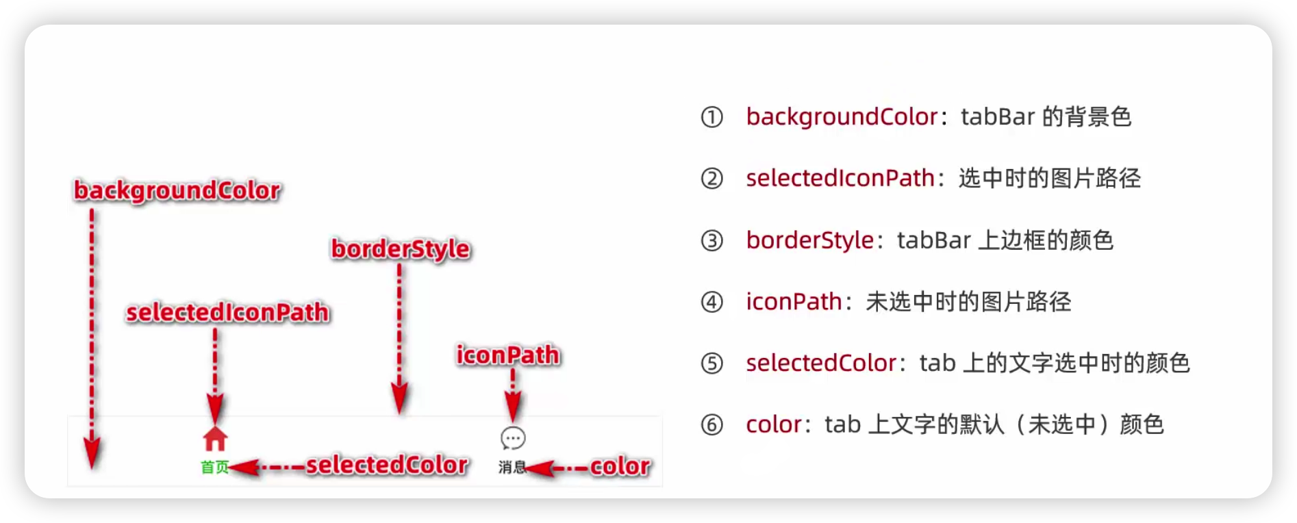
示例
pagePath页面的路径(必填项)
text名称(必填项)
iconPath未选中时的图标(选填)
selectedIconPath选中时的图标(选填)
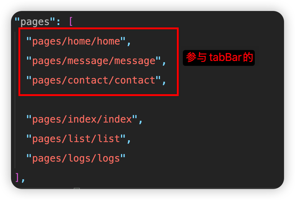
xxxxxxxxxx"window": {},"tabBar": { "list": [ { "pagePath": "pages/list/list", "text": "list", "iconPath": "/images/tabs/list.png", "selectedIconPath": "/images/tabs/list-active.png" }, { "pagePath": "pages/index/index", "text": "index", "iconPath": "/images/tabs/index.png", "selectedIconPath": "/images/tabs/index-active.png" } ] }注意:参与tabBar的页面需要在前面配置,否则无效
如图:
页面配置文件
概述
app.json中的配置会对每一个页面都生效,但是如果我们想要让某一个页面拥有特殊的样子,就可以借助于页面的.json配置文件,当页面配置文件与全局冲突时,就近原则,以页面配置文件为准
示例
在全局配置文件中,配置的标题栏的背景色为#F5B0C8,如果想要某个页面的不一样,则如下在相应的页面配置文件中配置
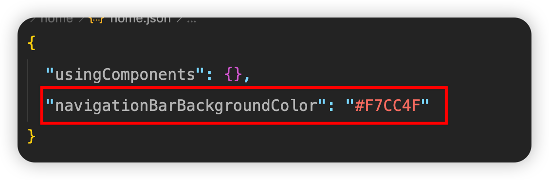
配置项与window节点处相同
小tips:
在配置下拉刷新时,建议在需要开启下拉刷新的页面中单独开启下拉刷新,而不是全局开启后再在某个页面关闭
数据请求
GET请求和POST请求
限制
只能请求HTTPS类型的接口
必须将接口的域名添加到信任列表中
GET请求示例
xxxxxxxxxx<button bindtap="getInfo"> 发起get请求</button>xxxxxxxxxxgetInfo() { wx.request({ url: "https://www.escook.cn/api/get", method: "GET", data: { name: 'zs', age: 20 }, success: (res) => { console.log(res) } })}POST请求示例
xxxxxxxxxx<button bindtap="postInfo"> 发起post请求</button>xxxxxxxxxxgetInfo() { wx.request({ url: "https://www.escook.cn/api/post", method: "POST", data: { name: 'zs', age: 20 }, success: (res) => { console.log(res) } })}怎么在页面刚加载时发请求
在onLoad里面调用相应函数即可
演示:
xxxxxxxxxxtestFunction(){  console.log("页面一加载就打印")},
  onLoad(options) {  this.testFunction()}
开发过程中如果遇到临时用不了https协议?
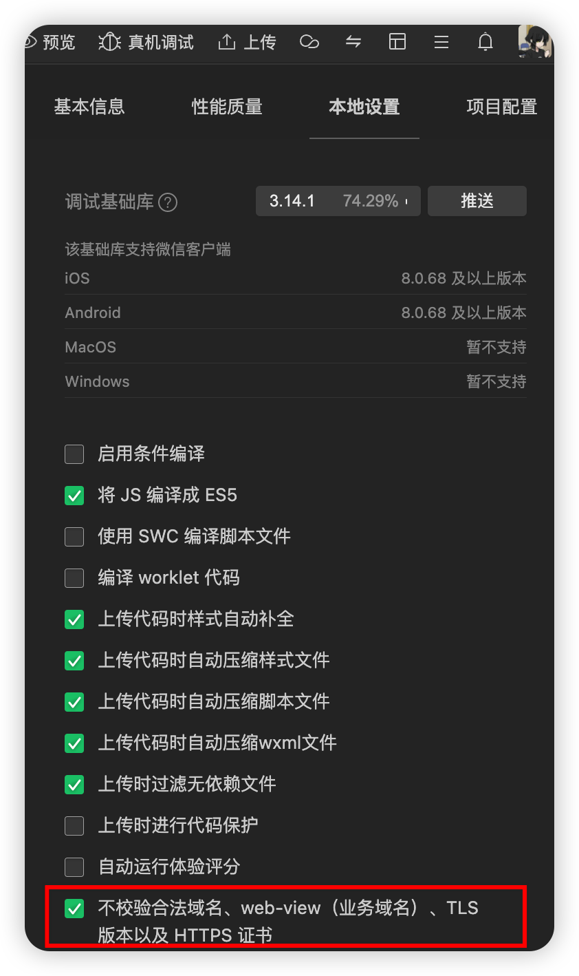
开启后即可
注意这个配置项只能在开发过程中使用,项目部署上线后不能使用
导航
声明式导航
在页面上声明一个
导航组件 通过点击
组件实现页面跳转
导航到tabBar页面
通过url指定要跳转的页面的地址
指定open-type="switchTab"
如果是跳转到tabBar对应的页面,必须要指定open-type="switchTab"
示例:
xxxxxxxxxx<navigator url="/pages/message/message" open-type="switchTab">跳转到消息页面</navigator>点击即可跳转
导航到非tabBar页面
通过url指定需要跳转的地址
指定open-type="navigate"(可以省略)
示例:
xxxxxxxxxx<navigator url="/pages/info/info" open-type="navigate">跳转到info页面</navigator>可以省略open-type="navigate"
点击即可跳转
后退导航
指定open-type="navigateBack"
指定delta="1"就是返回一级(一级可以省略)
示例:
xxxxxxxxxx<navigator open-type="navigateBack" delta="1">返回上一级</navigator>如果只需要后退一级
delta="1"可以省略,默认值就是1
编程式导航
利用微信官方提供的API接口
导航到tabBar页面
wx.switchTab({})
示例:
xxxxxxxxxx<button bindtap="gotoMessage">跳转到message页面</button>xxxxxxxxxxgotoMessage(){ wx.switchTab({ url: "/pages/message/message" })}
导航到非tabBar页面
wx.navigateTo({})
示例:
xxxxxxxxxx<button bindtap="gotoInfo">跳转到info页面</button>xxxxxxxxxxgotoInfona () { wx.navigateTo({ url: "/pages/info/info" })}
后退导航
wx.navigateBack
示例:
xxxxxxxxxx<button bindtap="gotoBack">后退</button>xxxxxxxxxxgotoBack(){ wx.navigateBack()}里面有delta参数
如果只是后退一层可以省略delta="1"
导航传参
传递参数
利用
? 设置参数
= 设置参数值
& 拼接各个参数
示例:
xxxxxxxxxxurl="/pages/message/message?name=zs&age=20"
接受参数
在onLoad生命周期函数里面利用options即可获取传过来的参数
示例:
xxxxxxxxxx"/pages/info/info?name=zs&age=20"xxxxxxxxxxonLoad(options) { console.log(options)}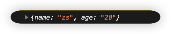
最佳实践:
在onLoad里面将传过来的参数利用setData方法存储到data里面,供其他地方使用
页面事件
下拉刷新
全局开启下拉刷新
在app.json的window节点中,将enablePullDownRefresh设置为true
局部开启下拉刷新(最佳实践)
在页面的json配置文件中,将enablePullDownRefresh设置为true
配置样式
监听页面的下拉刷新事件
在js文件里面有一个叫做onPullDownRefresh的方法,当触发下拉刷新时会执行这个方法
示例:
实现点击按钮count值+1,下拉刷新后count值重置为0
xxxxxxxxxx<view>{{ count }}</view><button type="primary" bindtap="addCount">+1</button>xxxxxxxxxxonPullDownRefresh() { this.setData({ count: 0 })},addCount() { this.setData({ count: this.data.count + 1 })}停止下拉刷新的效果
当处理完下拉刷新后,下拉刷新的效果不会主动消失,需要我们自己手动隐藏
调用wx.stopPullDownRefresh()可以停止当前页面的下拉刷新
示例:
xxxxxxxxxxonPullDownRefresh() { this.setData({ count: 0 }) wx.stopPullDownRefresh()}处理完该处理的任务后手动停止下拉刷新的效果
上拉触底
在页面的js文件中,通过onReachBottom函数可以监听页面的上拉触底事件
可以通过onReachBottomDistance来设置上拉触底的距离
默认值是50px
上拉触底时添加loading加载效果
参考微信官方文档:https://developers.weixin.qq.com/miniprogram/dev/api/ui/interaction/wx.showLoading.html
利用wx.showLoading和wx.hideLoading来添加loading效果和停止loading效果
1、在发送请求的时候添加loading效果
2、在请求发送完成以后的complete方法里面停止loading效果
示例:
xxxxxxxxxxgetColors() { // 在发送请求前添加loading加载效果 wx.showLoading({ title: "数据加载中" }) wx.request({ url: 'https://applet-base-api-t.itheima.net/api/color', method: 'get', success: ({ data: res }) => { this.setData({ colorList: [ this.data.colorList, res.data] }) }, // 请求发送结束以后 在complete方法里面停止loading加载效果 complete: () => { wx.hideLoading() } })}对上拉触底进行节流处理
个人理解:在进行数据的加载的时候,不妨试想一种情况,如果用户上拉到触发请求的距离,此时正在进行请求,用户拉上去再拉下来,请求还没结束又发起了请求,导致加载了很多数据出来,但是用户根本不需要这些数据,就造成了资源的浪费,所以我们需要进行节流处理
步骤:
1、在data里面定义一个节流阀取名为isLoading初始值为false
2、发送请求时将isLoading设置为true,请求结束后在complete方法里面将值设置为false
3、在上拉触底的触发函数onReachBottom里面进行判断,如果isLoading的值是true那就不发送请求
生命周期
应用生命周期函数
特指小程序才启动 - 运行 - 销毁期间依次调用的那些函数
需要在app.js中进行声明
onLaunch小程序初始化完成后自动触发,全局只触发一次
onShow小程序启动,或从后台进入前台时触发
onHide小程序从前台进入后台时触发
所谓的前后台就是手机应用的前后台,当你在小程序中就是前台,把小程序切到手机后台就是后台
xxxxxxxxxxApp({ onLaunch: () => { console.log('onLaunch') }, onHide: () => { console.log('onHide') }, onShow: () => { console.log('onShow') }})
页面生命周期函数
特指小程序中,每个页面的加载 - 渲染 - 销毁期间依次调用的那些函数
需要在页面的.js文件中进行声明
onLoad监听页面的加载,一个页面只调用一次
onShow监听页面显示
onReady监听页面的初次渲染完成,一个页面只调用一次
onHide监听页面隐藏
onUnload监听页面卸载,一个页面只调用一次
wxs(wxscript)
应用场景:
wxml无法调用在页面的js文件中定义的函数,但是可以调用wxs中定义的函数。因此,小程序中wxs的典型应用场景就是过滤器
wxs和JavaScript类似,但是本质上是两门不同的语言,不可混用
内嵌wxs脚本
1、在wxml文件里面添加wxs标签,为这个标签添加module属性,属性值就是以后调用的时候的名字,可以随便取
2、使用module.exports.方法名 = 函数的格式导出定义的方法
3、在wxml的标签中使用module属性值.方法名调用定义的方法即可
示例:
xxxxxxxxxx<view>  {{ m1.toUpper(username) }}</view>
<wxs module="m1">  module.exports.toUpper = function(str){    return str.toUpperCase()  }</wxs>
注意wxs不支持箭头函数的语法,在wxs里面不能使用箭头函数
定义外联wxs脚本
1、在utils文件夹中定义.wxs文件,在里面定义方法
2、定义的方法使用module.exports导出(不能使用属性值简写)
3、在需要使用的wxml里面使用wxs标签指定src(wxs文件的相对路径)和module属性值(自定)
4、然后使用module属性值.方法名调用方法
示例:
xxxxxxxxxxfunction toLower(str) {  return str.toLowerCase()}
module.exports = { toLower: toLower}在此处的导出中不可以像{ tolower }这样简写,必须使用完整写法
xxxxxxxxxx<view>  {{ m2.toLower(address) }}</view>
<wxs src="../../utils/tools.wxs" module="m2"></wxs>
注意点
1、wxs中定义的函数不能作为组件的事件回调函数
2、wxs中不能调用js文件中定义的函数
3、wxs中不能使用wx官方的API
补充
动态设置页面标题
在json文件中的标题是固定的,当需要拿某个参数当做页面标题的时候就很不方便
wx.setNavigationBarTitle()
使用此方法可以动态的设置页面的标题
从而避开json文件中设置标题过于固定的问题
示例:
xxxxxxxxxxonReady() { wx.setNavigationBarTitle({ title: this.options.title, })}在onReady中设置页面标题较为规范
此处可以使用this.options获取页面参数
也可以在onLoad方法里面将参数存储到data里面共享
动态设置url
在发送请求时使用`${}实现动态设置url
示例:
xxxxxxxxxxurl: `https://www.example.com/${this.options.id}/shop`返回的数据的键里面有横杠之类的字符怎么获取值
一般我们获取数据都是通过点的形式
eg:res.data.....
可以通过中括号的形式
示例:
xxxxxxxxxxres.header['X-Total-Count']技巧:字符串类型的数字怎么转换成数字类型
方法一:
xxxxxxxxxxNumber('80')方法二:
xxxxxxxxxx'80' - 0字符串类型与数字类型参与运算会转成数字类型
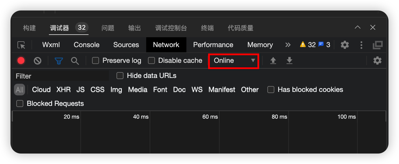
怎么模拟网速较慢的情况
在调试器的地方可以模拟网络较慢的情况
如图:
分页的时候没有数据了怎么处理
分页的时候会遇到数据加载完成的情况
这时候需要判断数据是否加载完成page * pageSize >= total
如果加载完成了就不再发送请求,并给用户一个消息提示框
wx.showToast({ title: '', icon: '' })
默认图标为success,如果不需要图标需指定icon='none'
示例:
xxxxxxxxxxif(this.data.page * this.data.pageSize >= this.data.total) { return wx.showToast({ title: "没有内容了", icon: 'none' })}利用短路运算符实现下拉刷新停止功能
示例:
xxxxxxxxxxonPullDownRefresh() { this.setData({ shopList: [], page: 1, total: 0 }), // 手动停止下拉刷新 传一个回调函数过去让流程执行完毕后马上执行停止下拉刷新的回调函数 this.getShopList(() => { wx.stopPullDownRefresh() })},getShopList(cb){ this.setData({ isLoading: true }) wx.showLoading({ title: "数据加载中..." }) wx.request({ url: `https://applet-base-api-t.itheima.net/categories/${this.options.id}/shops`, method: 'get', data: { _page: this.data.page, _limit: this.data.pageSize }, success: (res) => { this.setData({ shopList: [ this.data.shopList, res.data], total: Number(res.header['X-Total-Count']) }) }, complete: () => { wx.hideLoading() this.setData({ isLoading: false }) // 利用短路运算符处理传过来的回调函数 cb && cb() }})自定义组件
创建
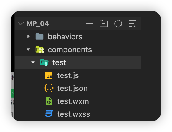
在组件根目录下创建一个components文件夹,里面再建一个文件夹,名字是组件的名称,对这个子文件夹右键选择新建component,输入组件的名称,即可(子文件夹的名称和组件名称保持相同)
引用
局部引用
在页面的json配置文件中为组件起名字后输入路径引用(这个名字就是后面使用它的名字)
示例:
xxxxxxxxxx// 在页面的json配置文件中{  "usingComponents": {    "my-test1": "/components/test/test"  }}
// 在对应页面的wxml中<my-test1></my-test1>// 就可以使用这个组件了
全局引用
在全局的app.json配置文件中注册组件就可以全局使用了
示例:
xxxxxxxxxx// 在全局的app.json配置文件中{  "usingComponents": {    "my-test1": "/components/test/test"  }}
// 在所有页面的wxml中<my-test1></my-test1>
组件和页面的区别
1、组件的json配置文件中有一个component:true配置项
2、页面的js文件中调用的是一个Page函数,而组件的里面调用的是一个Component函数
3、组件的事件处理函数需要定义到methods节点中,而页面的不需要,也没有methods节点
组件的样式隔离
1、组件里面定义的样式不会影响到其他的组件,也不会影响到页面
2、app.wxss里面的全局样式只有class选择器具有样式隔离的效果,id选择器,属性选择器,标签选择器不受样式隔离的影响
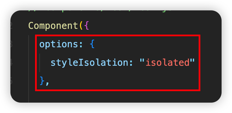
注意
组件的样式隔离可以通过设置来更改,上述的是默认效果
也就是在组件的js文件中通过
styleIsolation属性值来切换
isolated 默认值,开启隔离,不会影响其他页面和组件,全局的class选择器也无法影响组件
apply-shared 全局会影响组件,但是组件依然不会影响其他
shared 全局会影响组件,组件也会影响设置了shared和apply-shared的组件以及页面
数据、方法和属性
概述
1、数据和页面中一样需要定义到data节点里面
2、方法和页面不同,事件处理函数和自定义函数需要定义到methods节点里面(自定义方法建议以_开头)
示例:
xxxxxxxxxxmethods: { addCount() { this.setData({ count: this.data.count + 1 }) this._showCount() }, _showCount() { wx.showToast({ title: "count的值是:" + this.data.count, icon: 'none' }) }}properties属性
properties属性是用来接受外界传递到组件中的数据
用于声明接受的属性的类型,默认值
方法一:当不需要默认值时
xxxxxxxxxxproperties: { max: Number}方法二:当需要默认值时
xxxxxxxxxxproperties: { max: { type: Number, value: 10 // 默认值 }}传参方法
xxxxxxxxxx<my-test1 max="10"></my-test1>在组件里面接受传过来的值
xxxxxxxxxxthis.properties.maxdata和properties的区别
在小程序里面,data和properties本质上是一样的,都是可读可写的
示例:
xxxxxxxxxxshowInfo() { console.log(this.data) console.log(this.properties) console.log(this.data === this.properties)}
可以通过setData方法修改传过来的数据
示例:(max是传过来的数据)
xxxxxxxxxxthis.setData({max: 20})
数据监听器
类似与vue里面的watch侦听器
用于监听和响应任何属性和数据字段的变化,从而执行特定的操作
语法:
xxxxxxxxxxComponents({ observers: { '参数1, 参数2': function(参数1新值的形参, 参数2新值的形参) { // 操作逻辑 } }})使用示例:
xxxxxxxxxxdata: { num1: 0, num2: 0, num3: 0},methods: { num1Add() { this.setData({ num1: this.data.num1 + 1 }) }, num2Add() { this.setData({ num2: this.data.num2 + 1 }) }},observers: { 'num1, num2': function(n1, n2){ this.setData({ num3: n1 + n2 }) }}怎样监听对象属性的变化
xxxxxxxxxxComponent({observers: {'对象.属性A, 对象.属性B': function(属性A的新值, 属性B的新值) {// 触发此监听器的三种情况:// 为属性A使用setData赋值// 为属性B使用setData赋值// 直接对对象使用setData赋值}}})补充:
setData方法也可以用这种类似方式赋值
xxxxxxxxxxthis.setData({'对象名.属性名': 需要设置的新值})
怎么监听对象中所有属性的变化
xxxxxxxxxxComponent({observers: {'对象.**': function(obj) {// 想要获取新值的话就可以通过 obj.属性名console.log(obj.key)}}})
纯数据字段
不用于页面渲染的字段
定义为纯数据字段有利于提升页面的性能
如何使用:
在options节点中,指定pureDataPattern为一个正则表达式,符合这个表达式的字段将被定义为纯数据字段
示例:
xxxxxxxxxxComponents({ options: { pureDataPattern: /^_/ }, data: { a: true, // 普通数据字段 _b: true // 纯数据字段 }})组件全部的生命周期函数
created
组件示例刚刚被创建时执行(此时组件还没有被放到小程序的页面中)
注意在这个生命周周期函数里面不能使用setData
attached
组件实例刚刚进入页面的节点树的时候执行(刚被放到页面的UI结构中,但是还没有被渲染)
此时可以调用this.data
绝大多数的初始化工作可以在这个时候进行 例如发请求获取数据
ready
组件刚被渲染完成以后执行
moved
组件被移动的时候执行
detached
组件示例被从页面节点树移除的时候执行
当我们退出一个页面的时候,就会触发页面里面每一个组件的detached生命周期函数
此时适合做一些清理性质的工作
error
当组件抛出错误的时候执行(有一个Object类型的Error参数)
只有error声明周期函数有参数
如何定义组件的生命周期函数
利用lifetimes节点
xxxxxxxxxxComponent({ // 推荐用法 lifetimes: { attached() { }, detached() { }, }, // 以下是旧式的定义方式 attached() { }, detached() { }})当两种写法都写的时候旧的写法会失效
最佳实践:
使用推荐写法
组件所在页面的生命周期函数
当自定义组件的行为依赖于页面状态的变化,就需要使用组件所在页面的生命周期函数
show
组件所在页面被展示时执行
hide
组件所在页面被隐藏时执行
resize
组件所在页面尺寸变化时执行(有一个Object类型的Size参数)
如何定义组件所在页面的生命周期函数
注意,是在组件中定义,不是在页面中定义
使用pageLifetimes节点
示例:
xxxxxxxxxxComponent({ pageLifetimes: { show: function() { }, hide: function() { }, resize: function(size) { } }})插槽
单个插槽
在小程序中,默认每个自定义组件只允许使用一个
进行占位,这种个数上的限制叫做单个插槽
示例:
xxxxxxxxxx// 组件中<view>  // 对于不确定的内容使用slot进行占位  <slot></slot>  </view>
// 使用组件的时候<component-tag-name>  <view>这是插入到slot中的内容</view></component-tag-name>
ps:在当使用了slot占位之后,组件标签中写的内容就是slot标签中的内容
多个插槽
首先在组件所对应的js文件中添加multipleSlots
xxxxxxxxxxComponents({options: {multipleSlots: true}})ps:在新版小程序里面不添加此属性也可以使用多个插槽
使用多个插槽需要个slot标签定义name属性
xxxxxxxxxx<!-- 在组件中 --><view>  <slot name="before"></slot>  <slot name="after"></slot></view>
<!-- 使用组件时 --><component-tag-name>  <view slot="before">这是前面的内容</view>  <view slot="after">这是后面的内容</view></component-tag-name>
ps:单个插槽时也可以使用slot属性指定,默认名称是default
组件通信
属性绑定
通过在父组件(页面)中给组件标签添加属性,然后在组件中使用properties接受
示例:
xxxxxxxxxx<!-- 父组件(页面)中 --><component-tag-name valueName="value"></component-tag-name>
<!-- 组件中 --><!-- 在js中的properties中指定 -->Component({  properties: {    valueName: Number  }})
<!-- 在组件中 --><view>{{ count }}</view><!-- 如果是在js文件中想使用的话就要 this.properties.count -->
注意:
如果此时在子组件内部使用setData修改count的值,那组件中的count值确实会被修改,但是父组件(页面中的不会被修改)
易混淆点:
在前面的properties属性讲解中传送说过此时this.properties和this.data是等价的
注意此时利用setData在子组件中修改值,父组件中的不会被修改,只是子组件中的等价,但是与父组件中的不同
事件绑定
通过事件绑定实现修改子组件中的数据并同步到父组件中
1、由于修改父组件中的数据只能在父组件中,所以在父组件中定义一个方法用于修改数据
2、使用bind:自定义方法名="父组件中定义的方法名",将函数传递给子组件调用
3、在子组件中利用this.triggerEvent('自定义方法名', { 键名:需要传递的值 }),调用并传递参数值
4、在父组件中方法中利用e.detail.键名 接收传递过来的参数值,然后修改父组件中的数据
示例(在子组件中点击+1按钮实现父子组件中的count都+1):
xxxxxxxxxx// 父组件中syncAddCount(e) {  this.setData({    count: e.detail.value  })}<component-tag-name bind:sync="syncAddCount"></component-tag-name>
// 在子组件中<button bindtap="addCount">+1</button>
addCount() {  this.setData({    count: this.properties.count + 1  }) // 修改子组件中的数据  this.triggerEvent('sync', { value: this.properties.count }) // 调用父组件中定义的方法修改父组件中的数据}
使用this.selectComponent("id或class选择器")获取组件实例
示例:
xxxxxxxxxx// 父组件中<component-tag-name id="cA"></component-tag-name>
<button bindtap="getChild">获取子组件实例</button>
getChild() {  const child = this.selectComponent("#cA")  // 然后就可以利用child调用子组件中的方法了  // child.setData({ count: child.properties.count + 1 })   // child.子组件中定义的方法()}
注意当获取到子组件实例以后,子组件方法中的this要替换成子组件实例名,直接使用this的话是父组件中this,不是子组件的this
behaviors
behaviors相当于是一个共享代码块,可以共用一部分代码
1、创建(一般在项目根目录下创建一个behaviors文件夹,里面新建每一个js文件都是一个Behaviors)
xxxxxxxxxxmodule.exports = Behavior({ data: { username: 'zs' }, properties: { }, methods: { }})2、导入并使用
xxxxxxxxxx// 在需要导入的组件js文件中const myBehavior = require("../../Behavior路径")Component({  behaviors: [myBehavior],  // ....})
// 组件页面中<view>{{ username }}</view>
behaviors中所有可用的节点
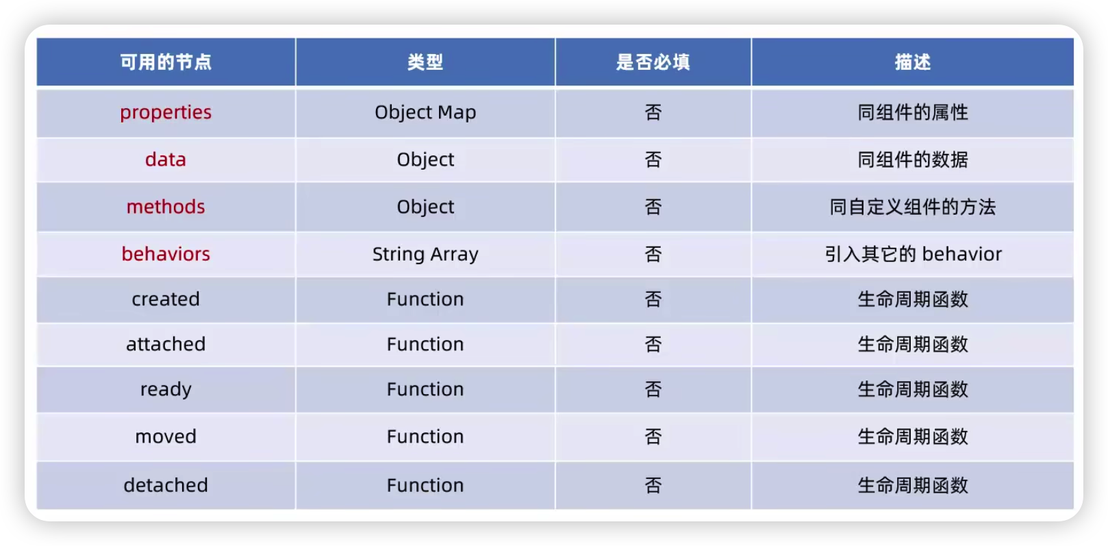
当相互使用的时候,可能会出现同名的情况,当重名时,参考微信官方给出的同名覆盖规则
Vant Weapp
用法查阅官方文档
这部分没什么说的,看文档就行了
官方文档:https://vant-ui.github.io/vant-weapp/#/home
使用CSS变量自定义vant主题
相关文档:https://developer.mozilla.org/zh-CN/docs/Web/CSS/Guides/Cascading_variables/Using_custom_properties
通过两个‘-’声明
示例:
xxxxxxxxxx<style> /* 在根节点html下声明 */ html { --main-color: #C00000; } .box1, .box2 { background-color: var(--main-color); } .box3 { color: var(--main-color) }</style>在根节点html下定义的意思是,这个声明的变量是有作用域的,出了这个作用域就无法生效了,所以在html下声明确保都能生效
最佳实践:
如果希望网页能够全局生效,那将他定义到根节点即可
定制全局主题样式
在app.wxss里面利用page节点做定制
示例:
xxxxxxxxxx<van-button type="primary ">这是primary的样式</van-button><view>~~~~~~~~~~</view><van-button type="danger ">这是danger的样式</van-button>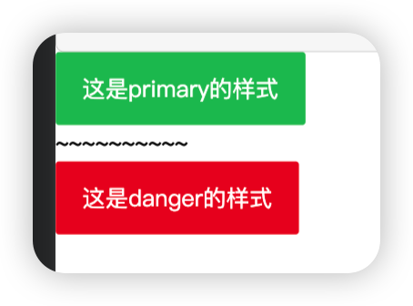
进行定制:
xxxxxxxxxxpage { --button-danger-background-color: #C00000; --button-danger-border-color: #D60000}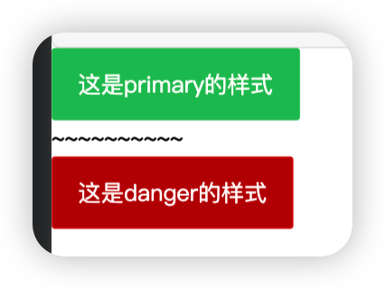
微信小程序中每一个页面的根节点都是
所以利用page就可以访问到所有的变量 对于怎么找到需要修改的主题色的名称,
参考官方文档:
https://vant-ui.github.io/vant-weapp/#/theme
注意里面的"@"是less的方式,在css中需要修改成"--"
API Promise化
小程序官方提供的异步API都是基于回调函数实现的,容易造成回调地狱的问题,导致代码可读性差。
升级改造为基于Promise的异步API可以提高代码的可读性维护型,避免回调地狱的问题
安装
xxxxxxxxxxnpm i --save miniprogram-api-promise建议每一次新安装包以后都把项目目录下的miniprogram_npm文件夹删除
然后重新构建npm
使用方式
在app.js中
xxxxxxxxxximport { promisifyAll } from "miniprogram-api-promise"
const wxp = wx.p = {}promisifyAll(wx, wxp)
然后就可以在页面中使用
示例(点击一个按钮发送网络数据请求):
xxxxxxxxxxasync getInfo() { const { data: res } = await wx.p.request({ method: "GET", url: "https://applet-base-api-t.itheima.net/api/get", data: { name: 'zs', age: 20 } }) console.log(res)}全局数据共享
就像vue里面的vuex一样,用于解决组件之间的数据共享问题
安装
xxxxxxxxxxnpm install --save mobx-miniprogram mobx-miniprogram-bindings定义store(定义数据方法)
在项目根目录下创建一个store文件夹,里面存储和数据共享有关的js文件,创建一个store.js用于创建store的实例对象
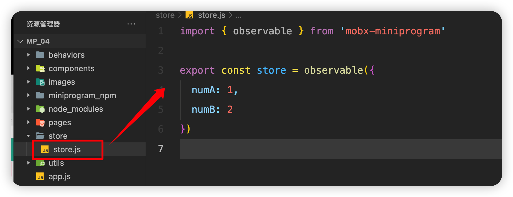
示例代码:
xxxxxxxxxximport { observable } from 'mobx-miniprogram'
export const store = observable({  numA: 1,  numB: 2})
如何定义计算属性
xxxxxxxxxximport { observable } from 'mobx-miniprogram'export const store = observable({numA: 1,numB: 2,get sum() {return this.numA + this.numB}})get的意思是他是只读的(计算属性也只能是只读的),他会根据值的变化自动地更改计算属性的值
Store里面的值不能直接被修改,只能让用户通过调用里面的方法来进行修改,否则非常的危险
如何定义action方法修改属性的值
xxxxxxxxxx// 需要导入 action 方法import { observable, action } from 'mobx-miniprogram'export const store = observable({numA: 1,numB: 2,get sum() {return this.numA + this.numB},// 定义 action 方法时注意要让 action 包裹起来updateNumA: action(function(step) {this.numA += step}),updateNumB: action(function(step) {this.numB += step})})
使用store(使用里面的数据方法)
语法演示:
xxxxxxxxxximport { createStoreBindings } from 'mobx-miniprogram-bindings'import { store } from '../../store/store'
Page({  onLoad: function () { // 生命周期函数--监听页面加载    this.storeBindings = createStoreBindings(this, {      store, // 意思就是数据源      fields: ['numA', 'numB', 'sum'], // 需要将哪些数据(字段和计算属性)绑定到当前的页面上      actions: ['updateNum'] // 需要将哪些方法绑定到页面上    })  },  onUnload: function () { // 生命周期函数--监听页面卸载    this.storeBindings.destroyStoreBindings() // 当页面卸载时将绑定的数据进行清理  }})
使用示例:
xxxxxxxxxx<view>{{ numA }} + {{ numB }} = {{ sum }}</view><van-button type="primary" bindtap="btnHandler" data-step="{{1}}">numA + 1</van-button><van-button type="danger" bindtap="btnHandler" data-step="{{-1}}">numA - 1</van-button>xxxxxxxxxx// pages/message/message.jsimport { createStoreBindings } from 'mobx-miniprogram-bindings'import { store } from '../../store/store'Page({ btnHandler(e) { this.updateNumA(e.target.dataset.step) }, /** * 生命周期函数--监听页面加载 */ onLoad: function (options) { this.storeBindings = createStoreBindings(this, { store, fields: ['numA', 'numB', 'sum'], actions: ['updateNumA', 'updateNumB'] }) }, /** * 生命周期函数--监听页面卸载 */ onUnload: function () { this.storeBindings.destroyStoreBindings() }})效果:利用store里面的数据和方法实现了点击按钮数据自增加一
将store中的数据或成员绑定到组件中
使用语法:
xxxxxxxxxximport { storeBindingsBehavior } from 'mobx-miniprogram-bindings'import { store } from '../../store/store'
Component({  behaviors: [storeBindingsBehavior],  fields: {    numA: () => store.numA,      // 绑定数据的第一种方式    numB: (store) => store.numB, // 绑定数据的第二种方式    sum: 'sum'                    // 绑定数据的第三种方式, 最简单,常用  },  actions: {    updateNumB: 'updateNumB'  }})
在绑定属性时,前面的名字可以自定义,但是使用的时候就要使用相应的名字
使用演示:
xxxxxxxxxx<view>{{ numA }} + {{ numB }} = {{ sum }}</view><van-button type="primary" bindtap="btnHandler" data-step="{{1}}">numA + 1</van-button><van-button type="danger" bindtap="btnHandler" data-step="{{-1}}">numA - 1</van-button>xxxxxxxxxx// components/numbers/numbers.jsimport { storeBindingsBehavior } from 'mobx-miniprogram-bindings'import { store } from '../../store/store'Component({ behaviors: [storeBindingsBehavior], storeBindings: { store, fields: { numA: 'numA', numB: 'numB', sum: 'sum', }, actions: { updateNumB: 'updateNumB' } }, /** * 组件的方法列表 */ methods: { btnHandler(e) { this.updateNumB(e.target.dataset.step) } }})
分包
基本概念
分包指的是把一个完整的小程序项目,按照需求划分为不同的子包,在构建时打包成不同的分包,用户在使用 时按需进行加载
分包的好处:
可以优化小程序首次启动的下载时间
在多团队共同开发时可以更好的解耦协作
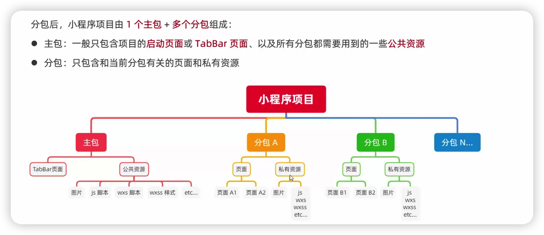
小程序的加载规则:
在小程序启动时,默认会下载主包并启动主包内的页面
tabBar页面需要放到主包中
当用户进入分包内的某个页面时,客户端会把对应的分包下载下来,下载完成后再进行展示
非tabBar页面可以按照功能的不同,划分为不同的分包之后,进行按需下载
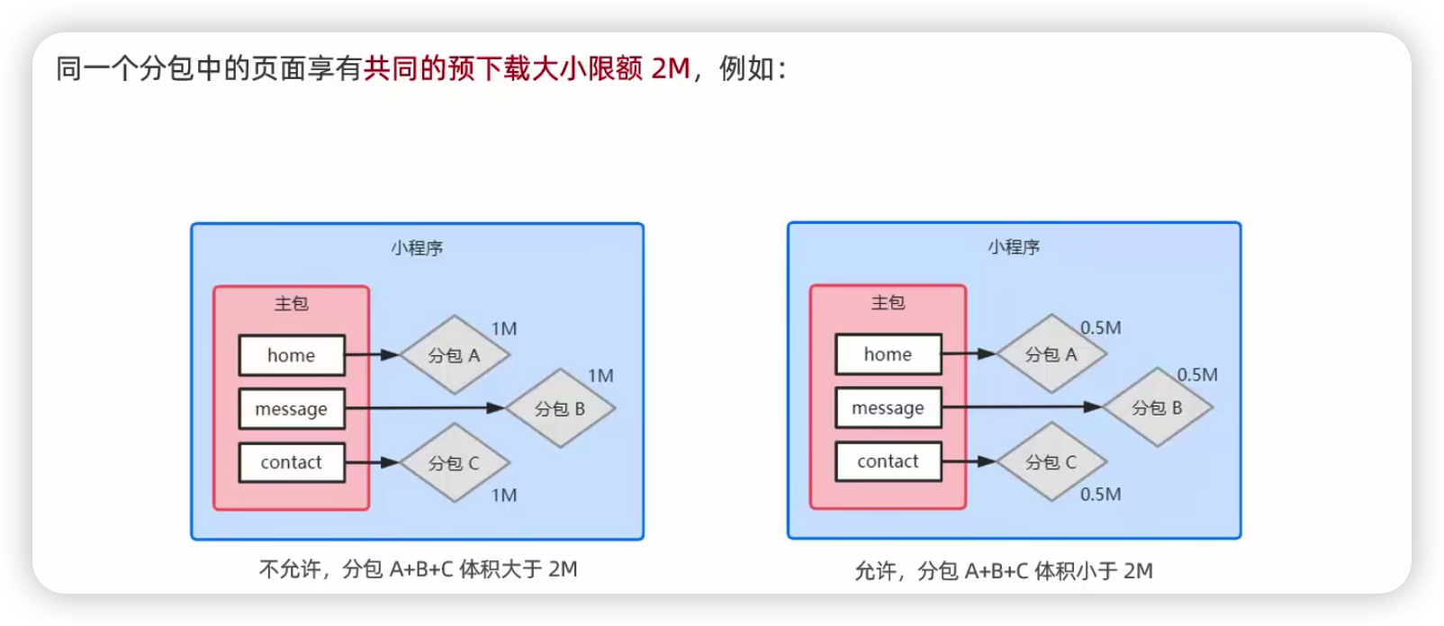
分包的体积限制
目前小程序分包的大小有以下两个限制:
整个小程序所有分包大小不超过16M(主包 + 所有分包)
单个分包/主包大小不能超过2M
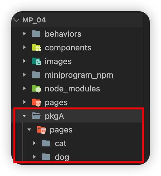
在app.json中和pages节点平级创建subpackages节点
注意:分包之间不能相互嵌套
xxxxxxxxxx{ "pages": [ ], "subpackages": [ { "root": "pkgA", // 分包存放的根目录名称 "name": "p1", // 为分包设置别名 "pages": [ // 页面存放路径 "pages/cat/cat", "pages/dog/dog" ] } ]}按下保存后微信开发者工具会自动在目录下创建相应的结构
分包的引用原则:
主包无法引用分包内的私有资源
分包之间不能互相引用私有资源
分包可以引用主包内的公共资源
简单来说就是:分包内的资源是相互独立私有的,主包内的是公共的
什么是独立分包
独立分包本质上也是分包,只不过他比较特殊,可以独立于主包和其他分包单独运行
xxxxxxxxxx{"pages": [],"subpackages": [{"root": "pkgA", // 分包存放的根目录名称"name": "p1", // 为分包设置别名"pages": [ // 页面存放路径"pages/cat/cat","pages/dog/dog"],"independent": true // 有此项配置的为独立分包}]}注意:独立分包与普通分包和普通分包完全隔绝,即使是主包里面的公共资源也不可以引用
配置分包预下载
在app.json中使用preloadRule定义分包的预下载规则
示例:
xxxxxxxxxx{ "pages": [], "preloadRule": { // 分包预下载的规则 "pages/contact/contact": { // 触发分包预下载的页面路径 // network 表示在指定的网络模式下进行预下载 // 可选值为:all (不限网络)和 wifi (仅wifi模式下进行预下载) // 默认值为: wifi "network": "all", // packages 表示进入页面后,预下载哪些分包 // 可以通过 root 或 name 指定预下载哪些分包 "packages": ["pkgA"] } }}分包预下载的限制:
案例:自定义tabBar
配置自定义tabBar的流程参考微信小程序官方给出的文档:https://developers.weixin.qq.com/miniprogram/dev/framework/ability/custom-tabbar.html
1、在app.json中对原有的tabBar增加"custom": true配置项
xxxxxxxxxx"tabBar": { "custom": true, "list": [ { "pagePath": "pages/home/home", "text": "首页", "iconPath": "/images/tabs/home.png", "selectedIconPath": "/images/tabs/home-active.png" }, { "pagePath": "pages/message/message", "text": "消息", "iconPath": "/images/tabs/message.png", "selectedIconPath": "/images/tabs/message-active.png" }, { "pagePath": "pages/contact/contact", "text": "联系我们", "iconPath": "/images/tabs/contact.png", "selectedIconPath": "/images/tabs/contact-active.png" } ]}2、在项目根目录下创建一个文件夹名叫custom-tab-bar(不可以用其他的名字)
3、在custom-tab-bar文件夹下新建Component名字叫index(不可以用其他名字)
4、利用vant组件配置基本样式(https://vant-ui.github.io/vant-weapp/#/tabbar)
xxxxxxxxxx<van-tabbar active="{{ active }}" bind:change="onChange"> <van-tabbar-item icon="home-o">标签</van-tabbar-item> <van-tabbar-item icon="search">标签</van-tabbar-item> <van-tabbar-item icon="friends-o">标签</van-tabbar-item> <van-tabbar-item icon="setting-o">标签</van-tabbar-item></van-tabbar>xxxxxxxxxx// custom-tab-bar/index.jsComponent({ data: { active: 0 }, methods: { onChange(event) { this.setData({ active: event.detail }); } }})目前效果:
5、自定义图标
xxxxxxxxxx<van-tabbar active="{{ active }}" bind:change="onChange"> <van-tabbar-item info="3"> <image slot="icon" src="/images/tabs/home.png" mode="aspectFit" style="width: 30px; height: 18px;" /> <image slot="icon-active" src="/images/tabs/home-active.png" mode="aspectFit" style="width: 30px; height: 18px;" /> 首页 </van-tabbar-item> <van-tabbar-item icon="home-o">标签</van-tabbar-item> <van-tabbar-item icon="search">标签</van-tabbar-item> <van-tabbar-item icon="friends-o">标签</van-tabbar-item> <van-tabbar-item icon="setting-o">标签</van-tabbar-item></van-tabbar>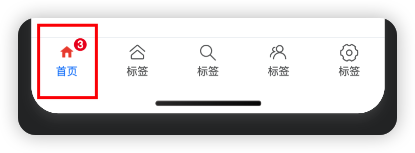
6、将list数组复制到index.js的data节点中,利用wx:for循环渲染
xxxxxxxxxx<van-tabbar active="{{ active }}" bind:change="onChange"> <van-tabbar-item wx:for="{{ list }}" wx:key="index"> <image slot="icon" src="{{ item.iconPath }}" mode="aspectFit" style="width: 25px; height: 25px;" /> <image slot="icon-active" src="{{ item.selectedIconPath }}" mode="aspectFit" style="width: 25px; height: 25px;" /> {{ item.text }} </van-tabbar-item></van-tabbar>xxxxxxxxxxdata: { active: 0, "list": [ { "pagePath": "pages/home/home", "text": "首页", "iconPath": "/images/tabs/home.png", "selectedIconPath": "/images/tabs/home-active.png" }, { "pagePath": "pages/message/message", "text": "消息", "iconPath": "/images/tabs/message.png", "selectedIconPath": "/images/tabs/message-active.png" }, { "pagePath": "pages/contact/contact", "text": "联系我们", "iconPath": "/images/tabs/contact.png", "selectedIconPath": "/images/tabs/contact-active.png" } ]}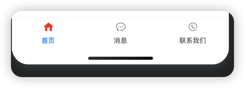
7、为了防止数字徽标溢出tabBar,设置徽标与文字的间距为0
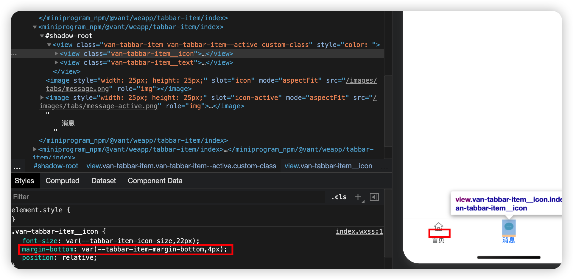
在他的父节点.van-tabbar-item设置--tabbar-item-margin-bottom: 0
注意:在自定义组件中如果需要覆盖样式,需要开启styleIsolation: 'shared'
xxxxxxxxxx// custom-tab-bar/index.jsComponent({ options: { styleIsolation: 'shared' } data: { active: 0, "list": [ { "pagePath": "pages/home/home", "text": "首页", "iconPath": "/images/tabs/home.png", "selectedIconPath": "/images/tabs/home-active.png" }, { "pagePath": "pages/message/message", "text": "消息", "iconPath": "/images/tabs/message.png", "selectedIconPath": "/images/tabs/message-active.png" }, { "pagePath": "pages/contact/contact", "text": "联系我们", "iconPath": "/images/tabs/contact.png", "selectedIconPath": "/images/tabs/contact-active.png" } ] }, methods: { onChange(event) { this.setData({ active: event.detail }); } }})xxxxxxxxxx.van-tabbar-item { --tabbar-item-margin-bottom: 0;}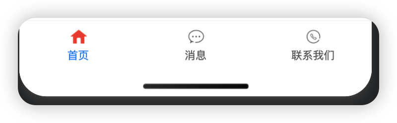
8、按需渲染数字徽标
xxxxxxxxxx<van-tabbar active="{{ active }}" bind:change="onChange"> <van-tabbar-item wx:for="{{ list }}" wx:key="index" info="{{ item.info ? item.info : ''}}"> <image slot="icon" src="{{ item.iconPath }}" mode="aspectFit" style="width: 25px; height: 25px;" /> <image slot="icon-active" src="{{ item.selectedIconPath }}" mode="aspectFit" style="width: 25px; height: 25px;" /> {{ item.text }} </van-tabbar-item></van-tabbar>xxxxxxxxxx// custom-tab-bar/index.jsComponent({ options: { styleIsolation: 'shared' } data: { active: 0, "list": [ { "pagePath": "pages/home/home", "text": "首页", "iconPath": "/images/tabs/home.png", "selectedIconPath": "/images/tabs/home-active.png" }, { "pagePath": "pages/message/message", "text": "消息", "iconPath": "/images/tabs/message.png", "selectedIconPath": "/images/tabs/message-active.png", info: 2 }, { "pagePath": "pages/contact/contact", "text": "联系我们", "iconPath": "/images/tabs/contact.png", "selectedIconPath": "/images/tabs/contact-active.png" } ] }, methods: { onChange(event) { this.setData({ active: event.detail }); } }})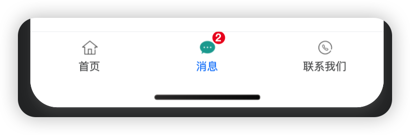
9、配置store数据共享
xxxxxxxxxx// custom-tab-bar/index.jsimport { storeBindingsBehavior } from 'mobx-miniprogram-bindings'import { store } from '../store/store'Component({ options: { styleIsolation: 'shared' }, behaviors: [storeBindingsBehavior], storeBindings: { store, fields: { sum: 'sum' }, actions: { } }, observers: { 'sum': function(val) { this.setData({ 'list[1].info': val }) } }, data: { active: 0, "list": [ { "pagePath": "pages/home/home", "text": "首页", "iconPath": "/images/tabs/home.png", "selectedIconPath": "/images/tabs/home-active.png" }, { "pagePath": "pages/message/message", "text": "消息", "iconPath": "/images/tabs/message.png", "selectedIconPath": "/images/tabs/message-active.png", info: 2 }, { "pagePath": "pages/contact/contact", "text": "联系我们", "iconPath": "/images/tabs/contact.png", "selectedIconPath": "/images/tabs/contact-active.png" } ] }, methods: { onChange(event) { this.setData({ active: event.detail }); } }})使用技巧:
xxxxxxxxxxthis.setData({'list[1].info': val})
10、实现页面切换效果
通过修改onChange事件处理函数
xxxxxxxxxx// custom-tab-bar/index.jsimport { storeBindingsBehavior } from 'mobx-miniprogram-bindings'import { store } from '../store/store'Component({ options: { styleIsolation: 'shared' }, behaviors: [storeBindingsBehavior], storeBindings: { store, fields: { sum: 'sum' }, actions: { } }, observers: { 'sum': function(val) { this.setData({ 'list[1].info': val }) } }, data: { active: 0, "list": [ { "pagePath": "/pages/home/home", // 要是根路径 "text": "首页", "iconPath": "/images/tabs/home.png", "selectedIconPath": "/images/tabs/home-active.png" }, { "pagePath": "/pages/message/message", "text": "消息", "iconPath": "/images/tabs/message.png", "selectedIconPath": "/images/tabs/message-active.png", info: 2 }, { "pagePath": "/pages/contact/contact", "text": "联系我们", "iconPath": "/images/tabs/contact.png", "selectedIconPath": "/images/tabs/contact-active.png" } ] }, methods: { onChange(event) { // event.detail 就是当前的页面索引 this.setData({ active: event.detail }); wx.switchTab({ url: this.data.list[event.detail].pagePath // 跳转到对应页面 }) } }})11、将active属性移到store里面实现切换效果
xxxxxxxxxx// store.jsimport { observable, action } from 'mobx-miniprogram'
export const store = observable({  numA: 1,  numB: 2,  activeTabbarIndex: 0,  get sum() {    return this.numA + this.numB  },  updateNumA: action(function(step) {    this.numA += step  }),  updateNumB: action(function(step) {    this.numB += step   }),  updateActiveTabbarIndex: action(function(index) {    this.activeTabbarIndex = index  })})
xxxxxxxxxx// custom-tab-bar/index.jsimport { storeBindingsBehavior } from 'mobx-miniprogram-bindings'import { store } from '../store/store'Component({ options: { styleIsolation: 'shared' }, behaviors: [storeBindingsBehavior], storeBindings: { store, fields: { sum: 'sum', active: 'activeTabbarIndex' }, actions: { updateActive: 'updateActiveTabbarIndex' } }, observers: { 'sum': function(val) { this.setData({ 'list[1].info': val }) } }, data: { "list": [ { "pagePath": "/pages/home/home", "text": "首页", "iconPath": "/images/tabs/home.png", "selectedIconPath": "/images/tabs/home-active.png" }, { "pagePath": "/pages/message/message", "text": "消息", "iconPath": "/images/tabs/message.png", "selectedIconPath": "/images/tabs/message-active.png", info: 2 }, { "pagePath": "/pages/contact/contact", "text": "联系我们", "iconPath": "/images/tabs/contact.png", "selectedIconPath": "/images/tabs/contact-active.png" } ] }, methods: { onChange(event) { // event.detail 就是当前的页面索引 this.updateActive(event.detail) wx.switchTab({ url: this.data.list[event.detail].pagePath }) } }})xxxxxxxxxx<van-tabbar active="{{active}}" bind:change="onChange"> <van-tabbar-item wx:for="{{ list }}" wx:key="index" info="{{ item.info ? item.info : ''}}"> <image slot="icon" src="{{ item.iconPath }}" mode="aspectFit" style="width: 25px; height: 25px;" /> <image slot="icon-active" src="{{ item.selectedIconPath }}" mode="aspectFit" style="width: 25px; height: 25px;" /> {{ item.text }} </van-tabbar-item></van-tabbar>12、修改选中项的文本的颜色值
xxxxxxxxxx<van-tabbar active="{{active}}" bind:change="onChange" active-color="#4DA59F">通过active-color属性